A spray chart is one of those visualizations that looks like it should require a graphics team and turns out to need about thirty lines of code. It is simply a top-down map of every ball a hitter put in play — one dot per batted ball, placed where the ball landed — and it tells you instantly things a stat line hides: whether a hitter yanks everything to the pull side, sprays line drives to all fields, or lives in the air to one gap. Statcast records the landing spot of essentially every batted ball, which means the raw material is free and public. The only trick is turning two cryptic coordinate columns into a recognizable baseball field.
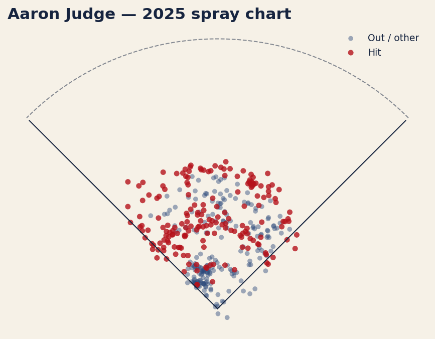
Here we do exactly that with Aaron Judge’s 2025 batted balls. Grab them from Statcast, scrub the bad rows, apply the one coordinate transform that makes everything snap into place, split hits from outs by color, and sketch the field around them. What comes out is 393 batted balls, 182 of them hits, scattered across a chart with foul lines and an outfield arc — the figure waits further down.
The setup
This tutorial assumes you already have pybaseball installed; if not, the companion piece on getting started with pybaseball covers installation and the basics in ten minutes. Beyond pybaseball we lean on numpy (for the outfield curve) and matplotlib. The imports:
import warnings; warnings.filterwarnings("ignore")
import matplotlib.pyplot as plt
import numpy as np
import pybaseball as pyb
We also need to identify our hitter and a date range. Statcast keys players by their MLB Advanced Media ID; Judge’s is 592450. We bracket the 2025 regular season with start and end dates:
PLAYER_ID = 592450          # Aaron Judge
START, END = "2025-03-27", "2025-10-01"
Pull the batted balls
One function does the fetching. statcast_batter takes a start date, an end date, and a player ID, and returns a DataFrame with one row per pitch the batter saw — every pitch, not just balls in play — carrying dozens of Statcast columns including exit velocity, launch angle, the pitch type, the result, and the two we care most about here.
df = pyb.statcast_batter(START, END, PLAYER_ID)That single call can take a few seconds; it is pulling a whole season of pitch-level tracking data. Because this is a Statcast endpoint rather than a FanGraphs one, it is reliable for automated use and will not rate-limit you the way scraped leaderboards do.
What hc_x and hc_y actually are
The two columns that make a spray chart possible are hc_x and hc_y — the Statcast “hit coordinate” fields. They record where a batted ball was fielded or landed, expressed in the pixel coordinate system of the original broadcast/tracking video feed. Two consequences follow from that origin. First, only rows that have a batted ball carry these values; called strikes, balls, and swinging strikes leave them blank. Second, the numbers live in an awkward frame: the origin sits in the top-left corner of the image, and — this is the part that surprises everyone — hc_y increases downward, the opposite of a normal math plot.
So before we can plot anything we clean and transform. First, drop every row missing a coordinate, then keep only rows where an actual event was recorded:
bb = df.dropna(subset=["hc_x", "hc_y"]).copy()
bb = bb[bb["events"].notna()]
The dropna on those two columns discards all the non-batted-ball pitches in one move. The events column names the outcome of a plate appearance — single, field_out, home_run, and so on — and is only populated on the final pitch of a PA, so filtering to events.notna() leaves us with exactly the batted balls that ended an at-bat.
The coordinate transform
Here is the line that does the magic, and it is worth understanding rather than copying blindly:
bb["x"] = bb["hc_x"] - 125.42
bb["y"] = 198.27 - bb["hc_y"]
Those two constants are the standard, widely used Statcast spray-chart transform. The value 125.42 is the pixel x-coordinate of home plate, so subtracting it recenters the horizontal axis on home plate: a ball pulled to the left-field line gets a negative x, one pushed to right field gets a positive x, and a ball straight up the middle sits near zero. The second line, 198.27 - hc_y, does two jobs at once. The 198.27 is home plate’s pixel y-coordinate, and subtracting hc_y from it both recenters the vertical axis and flips its direction — canceling that upside-down image convention — so that deeper fly balls now get a larger, positive y. The net effect: home plate lands at the origin and the field opens upward, exactly the way you would draw it on paper.
Classify hits versus outs
A spray chart is far more readable when hits and outs are different colors, and the events column already holds everything we need to split them. We define the set of events that count as hits and test membership:
hits = {"single", "double", "triple", "home_run"}
bb["is_hit"] = bb["events"].isin(hits)
That creates a boolean column, True for the four hit types and False for everything else — field outs, force outs, fielder’s choices, errors, and the rest. It is a deliberately strict definition: a reached-on-error ball is not scored a hit, and we leave it that way. Before plotting, a quick guard rail confirms the pull actually returned data — if fewer than fifty batted balls came back, something went wrong with the date range or ID, and we would rather raise an error than chart noise:
if len(bb) < 50:
    raise ValueError("too few batted balls: %d" % len(bb))
Draw the field
Now the plot. We split the cleaned frame into outs and hits, scatter each in its own color, then sketch the two foul lines and a rough outfield arc so the dots read as a baseball field rather than a random cloud of points.
fig, ax = plt.subplots(figsize=(7.2, 7.0))
outs = bb[~bb["is_hit"]]
hit  = bb[bb["is_hit"]]

ax.scatter(outs["x"], outs["y"], s=22, alpha=.45,
           edgecolor="none", label="Out / other")
ax.scatter(hit["x"], hit["y"], s=28, alpha=.8,
           edgecolor="none", label="Hit")

# foul lines + rough outfield arc
ax.plot([0, -230], [0, 230], color="black", lw=1)
ax.plot([0,  230], [0, 230], color="black", lw=1)
th = np.linspace(np.pi/4, 3*np.pi/4, 100)
ax.plot(330*np.cos(th), 330*np.sin(th), color="black", lw=1, ls="--", alpha=.5)

ax.set_aspect("equal")
ax.axis("off")
ax.set_title("Aaron Judge — 2025 spray chart", loc="left")
ax.legend(loc="upper right", frameon=False, fontsize=9)
plt.show()
A few details earn their keep. The two ax.plot lines draw foul lines from home plate at the origin out to the corners at a 45-degree angle — one to (-230, 230) for the left-field line, one to (230, 230) for right. The numpy block sweeps an angle from 45 to 135 degrees and traces a dashed arc of radius 330 to suggest the outfield wall. set_aspect("equal") is not optional: without it, matplotlib would stretch one axis and turn your symmetric field into a lopsided oval. And axis("off") hides the pixel-derived numbers, which mean nothing to a reader anyway. The result:
Reading it, and making it yours
The chart earns its keep at a glance. Judge’s 393 batted balls fan across all fields, with the red hit-dots clustering where you would expect a great hitter’s damage to live — 182 of those batted balls fell for hits. You can see pull tendency, opposite-field ability, and the depth of his fly balls in a single image, none of which a slash line conveys.
To run this for any hitter, change exactly one thing: the player ID. If you do not have it memorized, look it up by name — pyb.playerid_lookup("betts", "mookie") returns a small table whose key_mlbam column is the ID you drop into PLAYER_ID. Swap that number, adjust the season dates if you like, and rerun. Everything downstream — the transform, the hit/out split, the field — is hitter-agnostic and works unchanged.
The bottom line
A spray chart feels like advanced analytics and is really just careful data hygiene plus one coordinate transform. The hard parts — knowing that hc_x/hc_y exist, that hc_y runs upside down, and that subtracting 125.42 and flipping around 198.27 centers home plate — are now behind you. Pull the batted balls, drop the blanks, transform the coordinates, color the hits, draw the lines. From there, every hitter in baseball is one ID number away from a chart of his own.
Sources & Further Reading
- Theory: Chapter 6: Numerical Summaries: Center, Spread, and Shape — a free chapter at DataField.dev.
- Batted-ball data: Baseball Savant (Statcast), pulled via pybaseball’s
statcast_batter. Aaron Judge’s 2025 coordinates retrieved June 2026; re-runnable viascripts/spray_chart.py. - MLB.com — background on Statcast tracking and the hit-coordinate fields.
- Baseball-Reference — season context and the companion
batting_stats_brefpull used in the pybaseball quickstart.