Somewhere in the middle of a tense ballgame, a graphic flashes on the broadcast: “Win Probability: 78%.” It looks authoritative, almost clinical, as if a number that precise must be carved from something solid. It isn’t carved from anything — it’s counted. A win-probability model is, at bottom, an enormous tally of how often teams in exactly this situation have gone on to win, drawn from decades of games that already finished.
That makes the number both more trustworthy and more slippery than it looks. More trustworthy because it’s empirical, not a hunch. More slippery because two reputable models, fed the same game, will disagree — sometimes by a lot — and the reasons they disagree are exactly the assumptions buried inside that tidy percentage.
What a game state is
Before you can compute a win probability you have to describe the moment. Win-expectancy models reduce a baseball game to a compact “state” — a handful of variables that, taken together, capture everything that matters for what happens next. The standard ingredients are the inning, the number of outs, which bases are occupied, and the score margin. Stir in whether the team batting is home or away, because the home team bats last and that last lick is worth real probability.
Count the possibilities and the game is surprisingly finite. There are three out-states (0, 1, 2) and eight baserunner configurations (bases empty, man on first, first-and-second, and so on), which gives twenty-four base-out states. Layer inning and score margin on top and you still end up with a manageable, countable universe. Every pitch nudges the game from one of these states to another, and each state has a historical win rate attached to it.
How win expectancy is built
The construction is almost embarrassingly direct. Take a large database of completed games — tens of thousands of them — and for every state that ever occurred, ask one question: of all the times a team found itself here, what fraction eventually won? That fraction is the win expectancy (WE) for that state. Bottom of the seventh, one out, runner on second, down a run, at home: go pull every historical instance of that exact situation and count the wins. Maybe it’s 38%. That becomes the number on the screen.
Because the states are discrete and the sample is huge, no modeling cleverness is strictly required — it’s a lookup table built from history. The art lives in the edges: rare states (down seven in the ninth) have thin samples and get smoothed, and modern models often fit a curve across states rather than trusting each bucket’s raw count. But the core idea never changes. Win probability is a memory of how games like this one have tended to end.
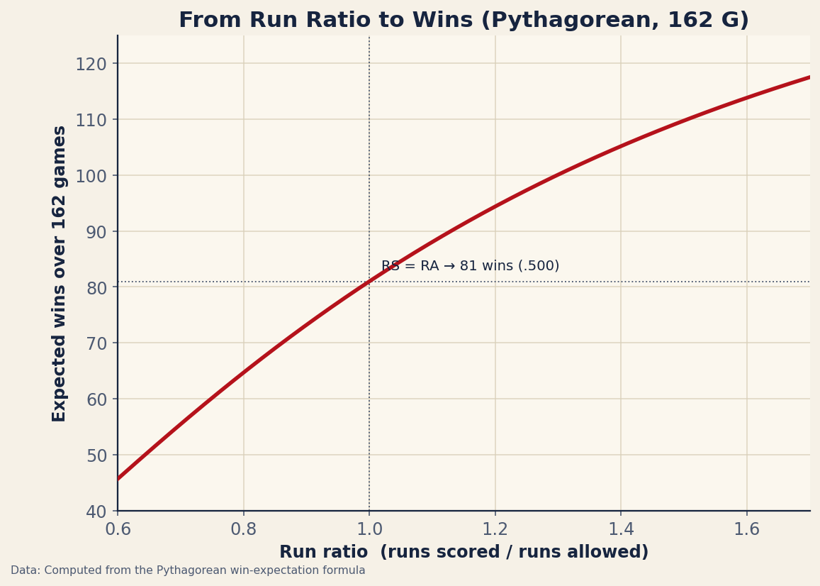
Zoom all the way out from a single play to a whole season and the same idea takes its simplest possible shape. The oldest win-expectation model in baseball — Bill James’s Pythagorean formula — maps a team’s ratio of runs scored to runs allowed onto an expected number of wins, no play-by-play required. The curve below is that relationship as exact math, and it is the conceptual ancestor of every in-game win-probability table: outscore your opponents and the expected-win payoff climbs steeply through the middle before flattening at the extremes.
WPA and leverage: measuring the swings
Once every state carries a win expectancy, two of the most useful concepts in the genre fall out for free. The first is Win Probability Added (WPA). Subtract the win expectancy before a play from the win expectancy after it, and you have the exact amount of victory that play created or destroyed. A go-ahead homer in the eighth might move the needle from 44% to 71% — that’s +0.27 WPA, credited to the batter and debited from the pitcher. Sum a player’s WPA across a game and you get a story-shaped stat: not how well he hit in the abstract, but how much his hits actually mattered to the result.
The second concept is leverage. Some states are dull — up nine in the second, almost nothing the next hitter does will change the outcome much. Others are knife-edged, where a single swing can move win probability twenty or thirty points. Leverage index quantifies that tension, measuring how much is riding on the current plate appearance relative to an average one. It’s why managers save their best reliever for a tie game in the ninth and not a blowout: high-leverage outs are worth multiples of low-leverage ones, and WPA proves it on the ledger.
A real curve, swinging
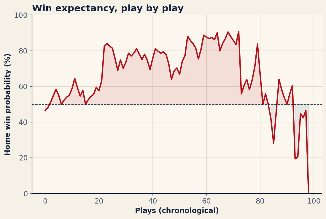
The figure above is not a simulation or a toy — it’s the home-team win-probability curve from an actual 2025 postseason game, the Toronto Blue Jays at home against the Los Angeles Dodgers, drawn play by play from the MLB Stats API. Across the game’s 99 plays you can watch every concept on this page do its work. Toronto’s win probability climbed and climbed until it peaked at 90.8% — the model was, at that moment, about as confident as it ever gets that the home team would win.
And then the line falls off a cliff. By the final play Toronto’s win probability reads 0.0%, because the home team blew its lead and lost. That collapse from roughly nine-in-ten down to zero is leverage made visible: each late swing in a close game carried enormous WPA, and a handful of them, stacked together, swung the entire outcome. A curve that placid in the early innings and that violent at the end is the whole reason win probability is worth charting — it shows you not just who won, but where the game was actually decided.
Why two models disagree
If win probability is just history counted, how can two models look at the same runner-on-second, one-out situation and post different numbers? Because they don’t share the same history, and they don’t make the same adjustments. Four sources of disagreement do most of the damage.
Different samples and eras. One model might build its lookup table from the last ten seasons; another from forty. Baseball’s run environment drifts — the 2000s scored very differently from the 2020s — so a state that was worth 38% in a high-offense era might be worth 41% in a low-offense one. The choice of which years to include is a quiet thumb on the scale.
Park and run-environment adjustments. A one-run lead is safer in a pitcher’s park than in a launching pad, because fewer runs are likely to follow. Some models adjust their win expectancies for the ballpark and the league’s scoring level; others use league-average states and ignore the venue. Same score, same inning, different probability.
Pure base-out-score versus team talent. The purest models care only about the game state — they treat every team as league-average and ask what happens from here. Others fold in pregame talent: a 96-win club nursing a one-run lead is genuinely more likely to hold it than a 70-win club, and a model that knows the rosters will say so. That single design decision can move a number several points, especially in lopsided matchups.
Extra innings and the ghost runner. Since the automatic runner on second arrived in extras, the win-expectancy math of the tenth inning and beyond changed overnight. Models that rebuilt their extra-inning states around the ghost-runner rule will disagree with any that still lean on pre-rule history, and the gap is largest in precisely the highest-leverage moments a postseason game tends to produce.
The bottom line
A win-probability number is an honest summary of the past pointed at the present: given how games in this exact state have ended before, here is your team’s share of the wins. WPA turns that into a measure of which plays mattered, and leverage tells you where to spend your best arms. But the precision is a costume. The instant a model has to choose its sample of history, decide whether to adjust for the park, and figure out what to do with a runner who teleported onto second, it has made judgment calls — and those calls are why the broadcast’s 78% and the website’s 74% can both be defensible. The curve in the figure swung from 90.8% to zero in a single evening. Treat every win-probability number with the same humility: it knows a great deal about the past, and nothing at all about what this game will actually do next.
Sources & Further Reading
- Win-probability curve: MLB.com (MLB Stats API, Gameday
winProbabilityfeed). Game data retrieved June 2026; computed for this article from that source. - FanGraphs — live win-probability graphs, WPA, and leverage-index leaderboards.
- Retrosheet — the play-by-play game logs that make historical win-expectancy tables possible.