The complaint is now a baseball cliche: the sport is splitting into superteams and tankers, with nothing in between. It's a real worry — when too many clubs are openly bad on purpose, the product suffers. But is it actually getting worse? I pulled the final standings for every full season from 2015 to 2024 and measured how spread out team records were each year. The answer is more interesting than the cliche: imbalance did climb sharply through the tank-for-draft-picks era, peaking in 2019 — but it has eased back since. Competitive balance isn't a straight line into the abyss; it crested and pulled back.
How to measure “top-heavy”
Competitive balance is just the spread of team quality. If every team finishes near .500, the league is balanced; if records fan out toward 110 wins and 110 losses, it's top-heavy. The clean way to capture that is the standard deviation of winning percentage across the 30 teams each season — a bigger number means a wider gap between the best and worst clubs. To make it readable, I convert it to a 162-game scale, so “12 wins” means teams typically finished about 12 wins above or below .500. It's the same idea behind the Noll-Scully measure, just tracked year by year.
The exhibit
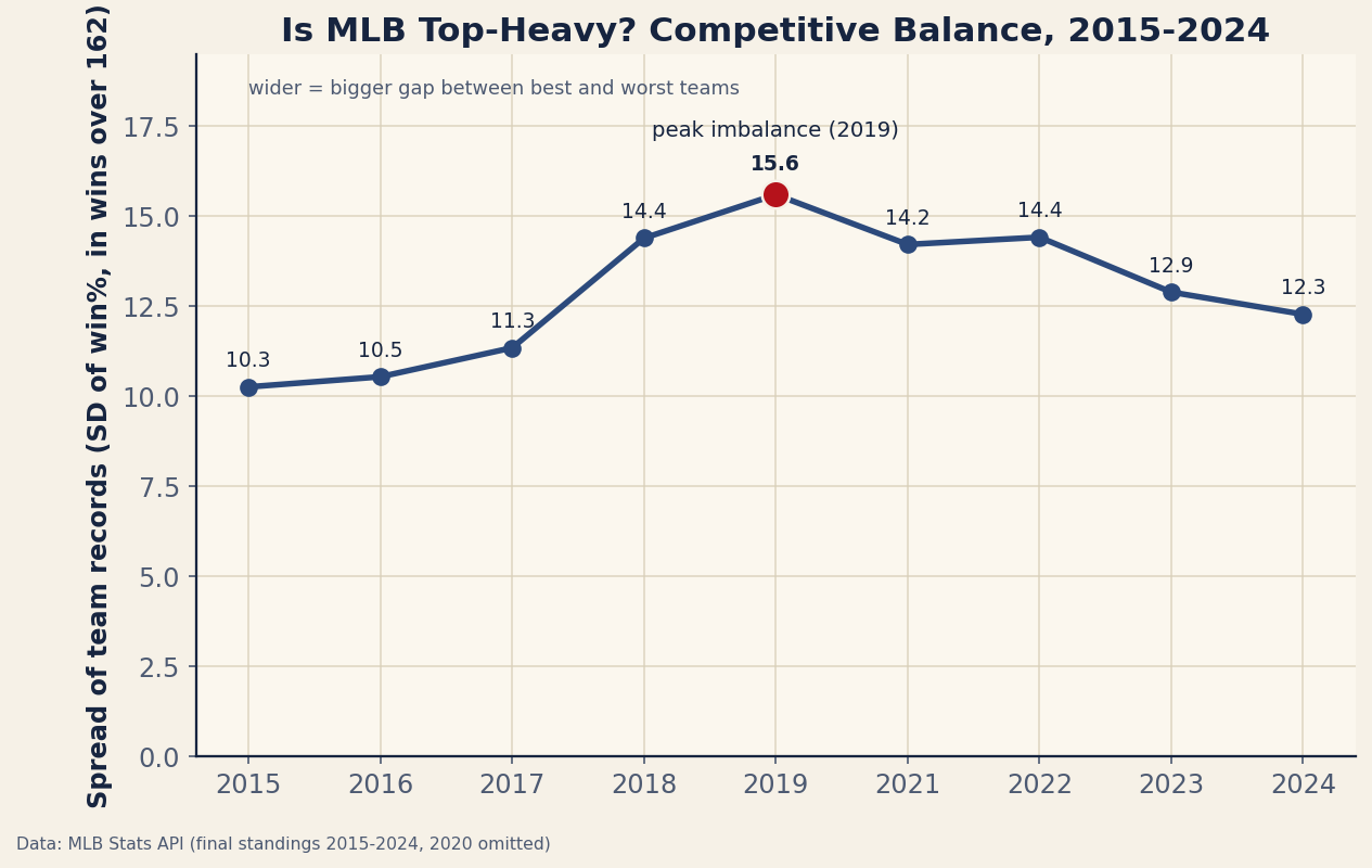
The shape tells the story. From 2015 to 2017 the spread sat around 10–11 wins — a fairly balanced league. Then it jumped: 14.4 in 2018 and a peak of 15.6 in 2019, the height of the tear-it-down-for-prospects movement, when several clubs lost 100+ games in the same years others won 100+. After the pandemic it stayed elevated (about 14 in 2021–2022) before falling to 12.9 in 2023 and 12.3 in 2024. The league is still less balanced than it was a decade ago, but the trend has clearly bent back from its peak.
A worked example: what the spread feels like
A spread of 10 wins (2015) means a typical good team won about 91 games and a typical bad one about 71 — a competitive middle class. A spread of 15.6 (2019) means the typical good team won about 97 and the typical bad one about 65, with the extremes pushing past 105 wins and 105 losses in the same season. That's the top-heavy league fans remember. By 2024 the spread is back near 12, roughly halfway between those two worlds. The cliche captured the 2018–2019 reality; it just stopped updating when the picture changed.
Why it rose — and why it eased
The climb lines up with the open embrace of tanking: with the draft and international pools rewarding the worst records, several front offices stripped their rosters at once, manufacturing extreme records at both ends and widening the spread. The recent easing has a few plausible causes — the expanded 12-team playoff (2022) raised the payoff for being mediocre-but-alive rather than terrible, new rules and revenue pressures nudged teams to compete, and some of the great tank rebuilds simply graduated into contenders. The honest read is that the league noticed the problem and the incentives shifted; the spread followed.
The honest caveats
- Spread of records isn't only about “effort.” A wide spread can come from a few genuinely great teams, a few genuinely awful ones, or deliberate tanking — the metric can't tell you why the gap is wide, only that it is.
- Single-season noise. One year's spread wobbles with luck; the 2024 figure is pulled up a bit by one historically bad team. The trend is the signal, not any single point.
- 2020 is missing. The 60-game COVID season is omitted because short schedules inflate the spread (less time for records to regress), which would distort the trend.
- It's win%, not payroll or talent. This measures outcomes, not the financial or competitive structure underneath them; a balanced-looking year can still hide large spending gaps.
The takeaway
Baseball did get more top-heavy — the tanking era was real, and the spread of team records widened by half between 2015 and its 2019 peak. But the story didn't end there: balance has improved for several years running, helped along by a bigger playoff field and shifting incentives. The next time someone says the league is more lopsided than ever, the standings say otherwise — it was most lopsided in 2019, and it's been trending back toward the middle since. For the single-season view of how balance is measured, see the Noll-Scully breakdown, and for the franchise-level version, the most and least consistent teams.
Reproduce it
For each season in data_layer/standings_2015_2024.json, take all 30 teams' winning percentages and compute their standard deviation, then multiply by 162 to put it on a wins scale. Plot by year. The chart is regenerated by charts/chart_balance_trend.py. No network at build time, nothing hand-entered.
Sources & further reading
- Free textbook: Chapter 6: Numerical Summaries: Center, Spread, and Shape — the theory behind this, at DataField.dev.
- Final standings 2015-2024: bundled
data_layer/standings_2015_2024.json, pulled from the MLB Stats API, charted bycharts/chart_balance_trend.py. - Related: how competitive was 2023? (Noll-Scully) and the most consistent franchises.