The central argument of Moneyball was a measurement claim: that the stat everyone worshipped — batting average — was one of the worst ways to value a hitter, and that on-base percentage, then underpriced, told you far more about scoring runs and winning games. Two decades later it's conventional wisdom, but it's worth re-checking against fresh data. So I took all 30 teams' 2024 batting lines and asked the only question that matters: which hitting stat actually correlates with winning? The answer is exactly the one Billy Beane bet the Athletics on. On-base percentage predicts wins; batting average is the weakest of the lot.
The test
For each of the 30 teams I lined up its 2024 team batting line — batting average, on-base percentage, slugging, OPS, and home runs — against its winning percentage, and computed the correlation. A correlation near 1 means the stat moves almost perfectly with winning; near 0 means it tells you little. This is the cleanest possible read on “which number should you actually care about”: not which sounds impressive, but which tracks the standings.
The exhibit
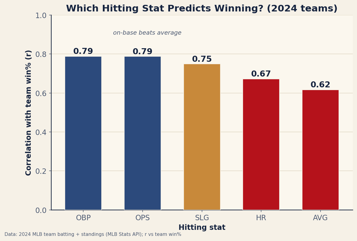
The ranking is unambiguous. OBP and OPS tie at the top (0.79), slugging is close behind (0.75), home runs land in the middle (0.67), and batting average brings up the rear (0.62). The gap between OBP (0.79) and AVG (0.62) is the whole Moneyball thesis in two numbers: the stat printed biggest on the scoreboard is the one that tells you least about whether the team is winning.
Why on-base beats average
The reason is mechanical, and it's about what each stat ignores. Batting average counts hits and treats a walk as a non-event — a hitter who walks 100 times is, to batting average, simply someone who failed to put 100 balls in play. But a walk does the single most important offensive thing: it avoids an out and puts a runner on base. Outs are the game's only truly scarce resource (you get 27), so a stat that's blind to the most common way of not making one is blind to a huge part of offense.
On-base percentage fixes exactly that — it credits walks and hit-by-pitches alongside hits, so it measures the thing that actually correlates with scoring: not making outs. OPS (on-base plus slugging) does nearly as well by bolting power onto on-base ability in one crude sum. The fact that OBP alone matches OPS here tells you how much of offense is simply getting on base.
A worked intuition
Picture two hitters. One bats .300 with a .320 on-base — lots of singles, almost never walks. The other bats .250 with a .380 on-base — fewer hits, but draws walks in bunches. Batting average crowns the first by 50 points; on-base percentage crowns the second by 60. Which helped his team more? The .250 hitter reached base 60 more times per 1,000 plate appearances and made 60 fewer outs — and the correlation in the chart says it's his profile that lines up with winning. Batting average literally can't see the difference that matters; OBP is built around it. This is also why wOBA and wRC+ exist — they refine the same on-base-plus-power idea with proper weights.
Where this read has limits
- One season, 30 points. A correlation from 30 teams in a single year is real but noisy; the exact values will wobble year to year. The ordering (OBP/OPS > SLG > AVG) is the robust, repeatable part — it shows up across seasons — not the second decimal.
- Offense is only half the team. Even the best hitting stat caps out around 0.79 because pitching and defense decide the rest. A team's record is hitting and run prevention; this chart only ranks the hitting side.
- These stats are correlated with each other. Good offenses tend to be above average at all of them at once, so the gaps between OBP, OPS, and SLG are smaller than they look — the clean separation is really AVG falling behind the on-base/power family.
- Team-level, not player-level. This says OBP predicts team wins; valuing an individual hitter adds park effects and context that park- and league-adjusted stats handle.
The takeaway
Re-run the Moneyball test on 2024 and it passes again: the hitting stats that track winning are the ones built around not making outs — on-base percentage and OPS — while batting average, the number on the jumbotron, is the weakest predictor of the five. The lesson Beane exploited is no longer a secret, but the math underneath it never expired. If you want one hitting number to glance at and learn something about a team's chances, make it OBP, not average.
Reproduce it
The data is bundled in data_layer/team_batting_2024.json (2024 team batting joined to final win%, pulled from the MLB Stats API). For each stat, compute corr(stat, winpct) across the 30 teams. The bar chart is regenerated by charts/chart_hitting_predicts_wins.py. No network at build time, nothing hand-entered.
Sources & Further Reading
- Free textbook: Chapter 22: Correlation and Simple Linear Regression — the theory behind this, at DataField.dev.
- 2024 team batting and standings: bundled
data_layer/team_batting_2024.json, pulled from the MLB Stats API (retrieved 2026-06-22), charted bycharts/chart_hitting_predicts_wins.py. - The on-base-over-average argument traces to Michael Lewis's Moneyball and the sabermetric tradition (Bill James, Pete Palmer) it drew on.
- Related: What is wOBA? and OPS+ vs wRC+ — the modern refinements of on-base-plus-power.