Run differential is the stat everyone reaches for when they want to know how good a team really is, and it earns that trust — but it hides something. A team at +30 could be a slugging machine that can't get anyone out, or a pitching fortress that scratches out three runs a night. Same number, opposite teams. So this season I split the number in two: runs scored per game (offense) and runs allowed per game (run prevention), and plotted all 30 teams. The headline, as of June 28 with about 82 games in the books, is simple and a little unfair: the Dodgers lead the league in both. Best offense, best run prevention, same team. That is rare, and it is why they own baseball's best record (53–30) and its best run differential (+150).
The exhibit: offense on one axis, prevention on the other
Here is the whole league on a single plot. Runs scored per game runs along the horizontal axis — further right is a better offense. Runs allowed per game runs up the vertical axis, inverted, so a team that gives up fewer runs sits higher. The dotted lines mark the league average, which this year is 4.49 runs per game on both axes (it has to be: every run scored is a run allowed by someone, so the two league averages are equal by definition).
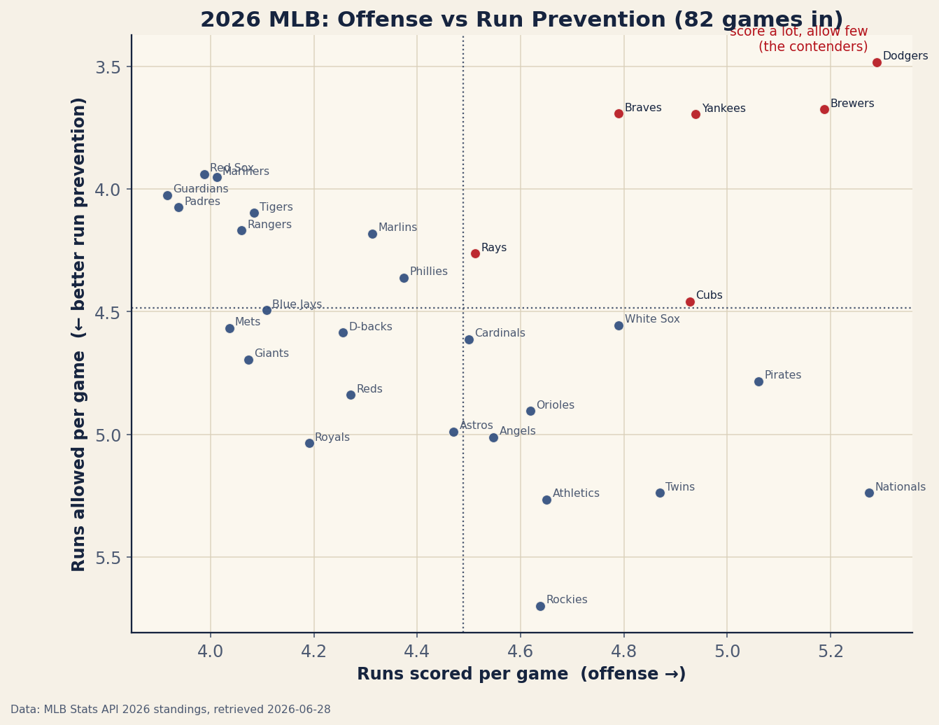
The dotted lines carve the plot into four quadrants, and the quadrant a team lands in tells you how it is winning or losing — something a single differential number can never do. Read it like this: top-right is good at both, bottom-left is bad at both, and the two off-diagonal corners are the specialists who do one thing well and the other badly.
Walking the four quadrants
Take them one at a time, with real teams, because the corners are the whole point.
Top-right — elite at both (the Dodgers). Los Angeles scores 5.29 runs a game, the most in baseball, and allows just 3.48, the fewest in baseball. No other team leads either category, let alone both. That is the rarest place to be: you can bludgeon opponents and you can smother them, and there is no obvious soft spot to attack. Five other teams share this above-average-at-both quadrant — the Braves, Brewers, Cubs, Rays, and Yankees — making six genuine two-way contenders by this measure. Those are the teams I would take seriously.
Bottom-right — score a lot, allow a lot (the Nationals). Washington is all bat and no arm: roughly 5.3 runs scored per game, which is a top-tier offense, against about 5.2 allowed. That is a great lineup running on a treadmill — nearly every run they put up, they hand right back. Their differential lands near break-even, so a casual glance at “+a few” would file them next to a mediocre team. The quadrant tells the real story: this is a fun, lopsided club that needs pitching, not hitting.
Top-left — prevent runs, score little (the Padres). San Diego is the mirror image: about 3.9 runs scored — a quiet offense — and roughly 4.1 allowed, strong run prevention. They win the way pitching-and-defense teams have always won, by keeping the game close and trusting the arms. Their differential might match Washington's, but you would build the two rosters in completely opposite directions. That is the information differential throws away.
Bottom-left — bad at both (the strugglers). The worst corner holds the teams that neither score nor prevent. The Guardians own the league's weakest offense at 3.92 runs scored per game; the Rockies own the worst run prevention at 5.70 allowed per game. Living down here is how you build the league's ugliest run differentials — there is no second skill to lean on when the first one fails.
The reason this matters is that run differential collapses two different skills into one number, and the Nationals and Padres prove it: hand me a differential near zero and I genuinely cannot tell you whether I am looking at a slugging team or a pitching team until I split the halves apart. The split is not a fancier stat — it is the same information, refusing to be averaged into mush.
Where this idea comes from
None of this is new. The notion that run differential has two halves that each carry their own weight runs straight through the sabermetric tradition — Bill James built Pythagorean expectation on runs scored and runs allowed as separate inputs, not their difference, and Pete Palmer's linear weights framework valued offense and run prevention on the same run scale precisely so they could be compared and added. The plot here is just the most literal possible version of that idea: put the two inputs on two axes instead of subtracting one from the other. If you want the machinery, I walk through it in how many runs a win costs and why run differential predicts next year better than wins.
The honest caveats
- It's half a season. About 82 games is enough to separate good from bad but not enough to be final — deadline trades, injuries, and plain regression will move every dot on this chart. Treat all of it as “as of June 28.”
- No park adjustment. Runs scored and allowed per game are raw — they don't correct for where the games are played. Coors Field inflates both a team's scoring and the runs it gives up, which is a big reason the Rockies' run prevention looks like the worst in baseball: some of that 5.70 is altitude, not pitching. A park-adjusted version would pull them toward the middle. The same caveat haunts any raw run total — see which hitting stat actually predicts wins for how much park and league context can distort a leaderboard.
- The two axes aren't fully independent. A dominant offense can rest a bullpen by building early leads, which quietly helps run prevention; a team trailing constantly burns its relievers and bleeds late runs. So the corners are a little correlated, not cleanly separate skills.
- It's descriptive, not predictive. This plot tells you how teams have played, not how they will. It is a snapshot of the first half, full stop — a starting point for asking questions, not an answer to them.
The takeaway
Split run differential into its two halves and the 2026 season reads differently. The Nationals and Padres, near-twins by differential, turn out to be opposite teams. The Guardians and Rockies struggle for opposite reasons — one can't score, the other can't get outs. And the Dodgers sit alone in the corner that almost no team reaches, leading the league in both scoring and prevention at once. That is the version of “best team in baseball” that actually tells you something. For the living, week-to-week version of the standings, the companion piece is the 2026 season so far, which refreshes from the same data.
Reproduce it
Runs scored and runs allowed per game come from data_layer/mlb_2026_standings.json, pulled live from the MLB Stats API, and the scatter plot is drawn by charts/chart_mlb_2026_offense_defense.py. The league average on both axes is 4.49; the quadrant lines are just that average drawn through the cloud of teams. Numbers move daily — this snapshot is only as current as its 2026-06-28 retrieval date.
Sources & further reading
- Free textbook: Chapter 5: Exploring Data: Graphs and Descriptive Statistics — the theory behind this, at DataField.dev.
- Live data: bundled
data_layer/mlb_2026_standings.json, pulled from the MLB Stats API, charted bycharts/chart_mlb_2026_offense_defense.py. - Companion tracker: the 2026 season so far, which refreshes the standings and run differentials from the same live feed.
- Related: run differential predicts next year better than wins and how many runs a win costs.