A season stat line is an average, and averages lie by omission. When you read that a hitter posted a great expected-wOBA-on-contact for the year, that single number quietly blends the week he couldn’t miss with the fortnight he looked lost. It tells you how good, but never when. A rolling average fixes exactly that: instead of one figure for the whole season, you average over a sliding window of recent batted balls and plot it across the year, and the hot streaks and slumps the season line flattens out appear as peaks and valleys.
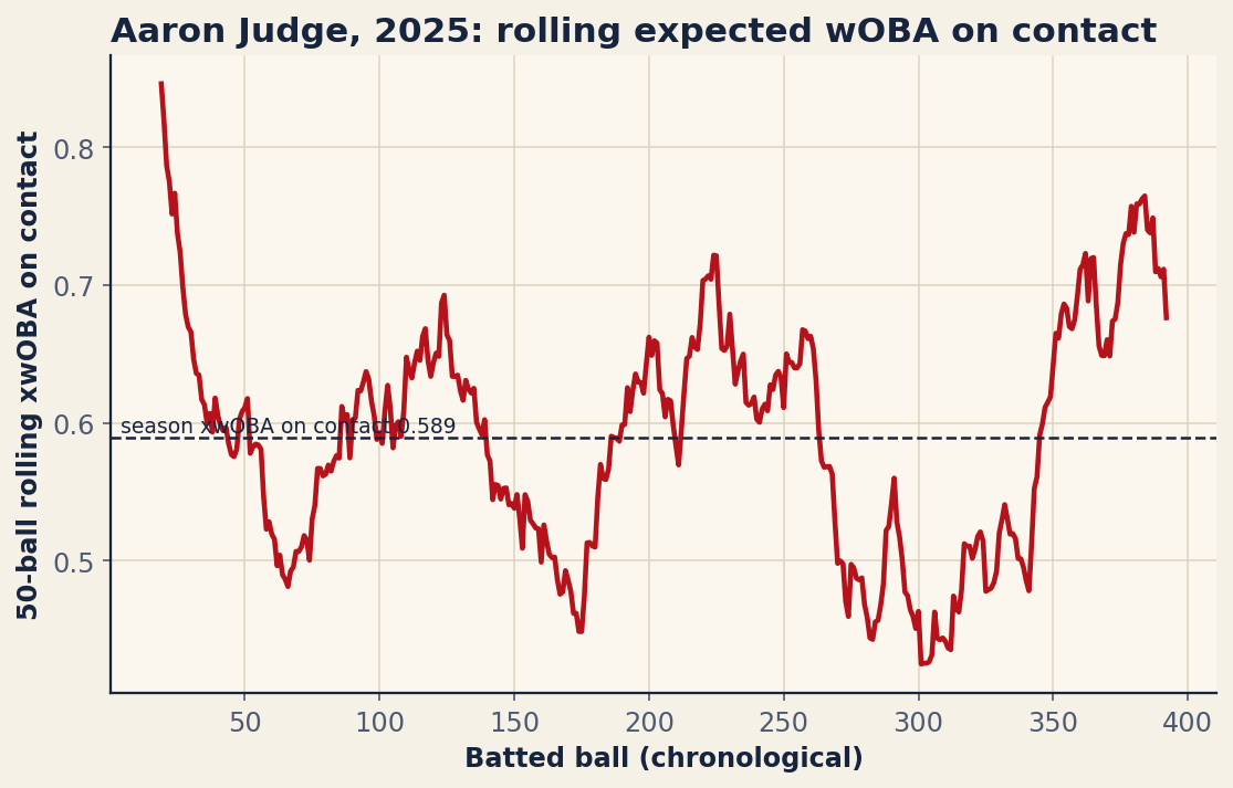
We will build that chart from scratch on Aaron Judge’s 2025 batted balls: grab them from Statcast, throw out the ones that don’t count, take a rolling mean of expected wOBA on contact, and lay it over a season-average reference line. Watch what falls out. The curve spikes to a scorching .846 at Judge’s peak and droops to .425 at his coldest, all around a flat season mark of .589 — the figure waits further down.
The setup
This tutorial assumes you already have pybaseball installed; if not, the companion piece on getting started with pybaseball covers installation in about ten minutes. Beyond pybaseball we only need matplotlib for the plot. The imports, plus a first line that silences the harmless warnings some of pybaseball’s backends emit:
import warnings; warnings.filterwarnings("ignore")
import matplotlib.pyplot as plt
import pybaseball as pyb
Then we name our hitter, a date range, and the size of the rolling window up front, where they are easy to change later:
PID, PLAYER = 592450, "Aaron Judge"
START, END = "2025-03-27", "2025-10-01"
WIN = 50
Statcast keys players by their MLB Advanced Media ID; Judge’s is 592450. The two dates bracket the 2025 regular season. WIN = 50 is the length of our rolling window — the number of recent batted balls we average over — and the single most important dial in the exercise, which we will return to.
Pull the batted balls
One function does the fetching. statcast_batter takes a start date, an end date, and a player ID, and returns a DataFrame with one row per pitch the hitter saw all season — complete with exit velocity, launch angle, pitch type, the result, and the expected-stats column we are after:
df = pyb.statcast_batter(START, END, PID)
col = "estimated_woba_using_speedangle"
That call can take a few seconds, because it is pulling a full season of pitch-level tracking data; being a Statcast endpoint rather than a scraped FanGraphs page, it is reliable for automated use and will not rate-limit you. The string we tuck into col names the column at the heart of this article, and it deserves a proper introduction.
What estimated_woba_using_speedangle means
That mouthful of a column name is Statcast’s expected wOBA on a batted ball, computed from just two inputs: how hard the ball was hit (launch speed) and at what vertical angle it left the bat (launch angle). Statcast has logged enough batted balls to know what a given speed-and-angle combination is worth on average — what wOBA outcome balls struck that way have historically produced — and assigns that value to each ball in play. A 110-mph line drive at 12 degrees gets a high number because balls like it are usually hits; a 78-mph pop-up gets almost nothing.
The crucial property is that it ignores what actually happened — whether the line drive was speared by a diving shortstop or split the gap, whether the park was cavernous or cozy, whether the defense was shifted. It scores the quality of contact alone, which makes it one of the cleanest measures of how well a hitter is striking the ball and the same idea that underpins the broader family of expected stats. Here we track it through time.
Clean and sort
Two filtering steps get us from “every pitch” to “every batted ball, in order.” First we keep only balls in play. Statcast’s type column tags each pitch with a single letter, and "X" marks a ball put in play — a true batted ball, as opposed to a called strike, a ball, or a swinging strike. Then we drop any remaining rows that lack an expected-wOBA value:
if "type" in df.columns:
    df = df[df["type"] == "X"]   # X = ball in play (true batted balls)
bb = df.dropna(subset=[col]).copy()
The type == "X" filter throws out every pitch that wasn’t hit into the field of play, and the dropna removes anything left without an expected-wOBA value — a belt-and-suspenders move, since by now nearly every row should have one. The .copy() tells pandas we mean to keep this slice as its own object, avoiding a SettingWithCopyWarning when we add a column next.
A rolling average is only meaningful if the rows are in the order the events happened, so we sort chronologically — by game date, and within a date by at-bat number when that column is present, so two batted balls in the same game stay in sequence:
bb = bb.sort_values(["game_date", "at_bat_number"]) if "at_bat_number" in bb else bb.sort_values("game_date")The rolling window
Here is the line the whole article is built around, and it is a single, readable pandas idiom:
bb["roll"] = bb[col].rolling(WIN, min_periods=20).mean()
season = float(bb[col].mean())
Read .rolling(WIN, min_periods=20).mean() left to right. rolling(50) slides a 50-row window down the chronologically sorted batted balls, gathering the 50 most recent at each position; .mean() averages the expected-wOBA values inside it. The result, a new roll column, is one smoothed number per batted ball — each point reflecting how Judge had been hitting over his last fifty balls in play at that moment. The min_periods=20 clause says: emit nothing until at least 20 batted balls are available, which keeps the jumpy start of the season — where an average over three or four balls swings wildly — off the chart. The second line computes the flat season average for comparison.
Before plotting, one guard rail confirms the pull returned a usable season; if fewer batted balls came back than the window itself, the date range or ID is wrong, and we would rather raise an error than chart noise:
if len(bb) < WIN:
    raise ValueError("too few batted balls: %d" % len(bb))
For Judge’s 2025, none of that trips: the pull returns 393 batted balls, well clear of the window, at a season expected wOBA on contact of .589.
Plot the streaks
Now the picture. We plot the rolling series against a horizontal dashed line at the season average, label that line, and title the chart:
fig, ax = plt.subplots(figsize=(8.6, 5.0))
x = range(len(bb))
ax.plot(x, bb["roll"], lw=2.2)
ax.axhline(season, color="black", ls="--", lw=1.2)
ax.text(len(bb) * 0.01, season + .004,
        "season xwOBA on contact %.3f" % season, fontsize=9)
ax.set_xlabel("Batted ball (chronological)")
ax.set_ylabel("%d-ball rolling xwOBA on contact" % WIN)
ax.set_title("%s, 2025: rolling expected wOBA on contact" % PLAYER, loc="left")
plt.show()
The ax.plot draws the rolling curve batted ball by batted ball; the axhline lays down the season average as a flat reference, and the ax.text labels it so a reader knows the baseline at a glance. The y-axis label carries the window size so the chart is self-documenting. Swap plt.show() for fig.savefig("rolling_xwoba.png") to write it to a file instead. The result:
Reading the curve
This is where a rolling chart earns its keep. The flat dashed line says Judge’s contact was worth a .589 expected wOBA for the season — elite, the kind of number that headlines a leaderboard. But the curve tells the story the average can’t. At his hottest the rolling figure climbed to .846, a run of fifty batted balls so violent the average ball was, in expectation, nearly a double; at his coldest it fell to .425, still respectable but a different hitter entirely. That gap, peak to trough, is the streakiness a season line buries: hot stretches pull the curve above the dashed line, slumps sag it below, and you see precisely when Judge was at his best and how long it lasted.
Tuning the window, and swapping the hitter
The WIN constant is a genuine tradeoff. A smaller window — say 25 — hugs the data tightly, reacting fast to catch short, sharp tears but jittering as a couple of loud batted balls yank it around. A larger window — 75 or 100 — produces a smoother line that ignores brief noise but also blurs the very streaks you came to find. Fifty is a sensible default for a full season of one hitter; change the one number and the whole chart re-tunes itself.
Running this for any other hitter means changing exactly one thing: the player ID in PID. If you do not have it memorized, look it up by name — pyb.playerid_lookup("ohtani", "shohei") returns a small table whose key_mlbam column is the ID you drop in. Swap that number, adjust the dates if you like, and rerun; everything downstream — filter, sort, rolling mean, plot — is hitter-agnostic and works unchanged. From there it is a short hop to the companion tutorial on building a spray chart from Statcast, which takes the same statcast_batter pull and maps where a hitter sprays the ball rather than when he heats up.
The bottom line
A rolling chart is a small idea with an outsized payoff: take a stat you already trust, average it over a sliding window of recent events, and plot it through time. The season number tells you the destination; the curve tells you the journey. For expected wOBA on contact — already scrubbed of luck and ballpark — that journey is a remarkably honest picture of a hitter heating up and cooling down. Pull the batted balls, keep the ones in play, roll the mean, draw the line. Every hitter is one ID number away from a chart of his own hot and cold streaks.
Sources & Further Reading
- The underlying math is worked through in Chapter 6: Numerical Summaries: Center, Spread, and Shape (free, DataField.dev).
- Batted-ball data: Baseball Savant (Statcast), pulled via pybaseball’s
statcast_batter. Aaron Judge’s 2025 expected-wOBA-on-contact values retrieved June 2026; re-runnable viascripts/rolling_xwoba.py. - MLB.com — background on Statcast tracking and the expected-statistics models.
- FanGraphs — for the underlying wOBA scale that expected wOBA is calibrated to.